Project3
Project 3
Kara Belknap & Cassio Monti 2022-11-5
- Report for the tech Data Channel
Report for the tech Data Channel
This report contains Exploratory Data Analysis (EDA) about the tech data channel and a modeling section applying different regression methods which attempt to predict trends about article sharing on the Mashable website.
Introduction
The objective of this analysis is to provide a comprehensive overview
about publication metrics and their relationship with the number of
shares that those publications presented during the study period. These
data have been collected from Mashable website, one of the largest news
websites from which the content of all the tech channel articles
published in 2013 and 2014 was extracted. The full data description can
be found
here.
These data were originally collected and analyzed by Fernandes et
al. (2015), in which the authors performed
classification task comparing several machine learning algorithms. In
the present study, a subset of the data used by Fernandes et al.(2015)
corresponding to the data channel tech is used for regression
purposes. The response variable is the number of shares that the
papers presented after publication. In other words, we will try to
predict the number of shares that the papers will have before
publication and evaluate the prediction of each selected model based on
some common metrics, such as RMSE (Root Mean Squared Error), RSquared
(Coefficient of Determination), and MAE (Mean Absolute Error) applied to
the test set. To perform the regression, the methods Random Forest,
Boosting, Multiple Linear Regression, and LASSO regression will be used.
More information about the methods will be provided in the corresponded
sections.
Some metrics have been calculated based on the information obtained from Mashable website. For instance, the Latent Dirichlet Allocation (LDA) was applied to the data set to identify the 5 top relevant topics and then measure the closeness of the current article to such topic. There are 5 relevance of topic metrics according to LDA:
LDA_00: Closeness to LDA topic 0LDA_01: Closeness to LDA topic 1LDA_02: Closeness to LDA topic 2LDA_03: Closeness to LDA topic 3LDA_04: Closeness to LDA topic 4
Additionally, some quality metrics related to the keywords have been calculated and will be used in this analysis. These metrics represent the average number of shares for publications with worst, best, and average keywords. The classification of keywords under these groups was made by the authors of the original paper. The keyword metrics are shown below.
kw_avg_min: Worst keyword (avg. shares)kw_avg_max: Best keyword (avg. shares)kw_avg_avg: Avg. keyword (avg. shares)
Article content metrics were also used in this study. These are general metrics about the body of the publication that can influence the number of shares of that paper. The content summary metrics are shown below.
num_videos: Number of videosn_tokens_content: Number of words in the contentn_non_stop_unique_tokens: Rate of unique non-stop words in the contentnum_hrefs: Number of linksnum_self_hrefs: Number of links to other articles published by Mashableaverage_token_length: Average length of the words in the content
These data were collected during 2013 and 2014 on daily basis. To
represent time dependent information, a binary variable indicating
whether the publication was made in a weekend or weekday, is_weekend
is used.
Data Import and Manipulation
Required Packages
Before we can begin our analysis, we must load in the following packages:
library(tidyverse)
library(caret)
library(GGally)
library(knitr)
Tidyverse is used for data management and plotting through dplyr and
ggplot packages. Caret package is used for data splitting and
modeling. GGally is used for nice correlation and exploratory plots
assisting in the visualization. knitr package is used to provide nice
looking tables.
Read in the Data
Using the data file OnlineNewsPopularity.csv, we will read in the data
and add a new column corresponding to the type of data channel from
which the data was classified. The new variable will be called
dataChannel. Note that there are some rows that are unclassified
according to the six channels of interest and those are indicated by
other. The data indicated by other was excluded from all reports
since the data had not been assigned to one of our channels of interest.
Once the data column is created, we can easily subset the data using the
filter function to create a new data set for each data channel. We
removed the original data_channel_is_* columns as well as two
non-predictive columns url and timedelta.
# reading in the data set
rawData <- read_csv("../OnlineNewsPopularity.csv")

# creating new variable to have more comprehensive names for data channels.
rawDataChannel <- rawData %>%
  mutate(dataChannel = ifelse(data_channel_is_lifestyle == 1, "lifestyle",
                              ifelse(data_channel_is_entertainment == 1, "entertainment",
                              ifelse(data_channel_is_bus == 1, "bus",
                              ifelse(data_channel_is_socmed == 1, "socmed",
                              ifelse(data_channel_is_tech == 1, "tech",
                              ifelse(data_channel_is_world == 1, "world",
                                     "other"))))))) %>%
  select(-data_channel_is_lifestyle, -data_channel_is_entertainment,
         -data_channel_is_bus, -data_channel_is_socmed, -data_channel_is_tech,
         -data_channel_is_world, -url, -timedelta)

# assigning channel data to R objects.
lifestyleData <- rawDataChannel %>%
  filter(dataChannel == "lifestyle")

entertainmentData <- rawDataChannel %>%
  filter(dataChannel == "entertainment")

busData <- rawDataChannel %>%
  filter(dataChannel == "bus")

socmedData <- rawDataChannel %>%
  filter(dataChannel == "socmed")

techData <- rawDataChannel %>%
  filter(dataChannel == "tech")

worldData <- rawDataChannel %>%
  filter(dataChannel == "world")
Select Data for Appropriate Data Channel
To select the appropriate data channel based on the params$channel, we
created a function selectData which would return the appropriate data
set and assign it to the data set activeData. This will be the file we
will use for the remainder of the report.
# function to assign automated calls for the different data channels
selectData <- function(dataChannel) {
  if (dataChannel == "lifestyle"){
    return(lifestyleData)
  }
  if (dataChannel == "entertainment"){
    return(entertainmentData)
  }
  if (dataChannel == "bus"){
    return(busData)
  }
  if (dataChannel == "socmed"){
    return(socmedData)
  }
  if (dataChannel == "tech"){
    return(techData)
  }
  if (dataChannel == "world"){
    return(worldData)
  }
}

# activating corresponding data set.
dataChannelSelect <- params$channel

activeData <- selectData(dataChannelSelect)
Summarizations for the tech Data Channel
In this section, we will perform EDA for the data channel tech.
Data Manipulation for EDA
Data Split
This section splits the data set into training and test sets for the
proportion of 70/30. The data summarizing will be conducted on the
training set. To split the data, the function createDataPartition(),
from caret package, was used with the argument p=0.7 to represent
70% of the data should be in the split. The function set.seed(555) was
used to fix the random seed. The code below shows the creation of
training and test sets.
set.seed(555)

trainIndex <- createDataPartition(activeData$shares, p = 0.7, list = FALSE)

activeTrain <- activeData[trainIndex, ]

activeTest <- activeData[-trainIndex, ]
Outlier Detection and Cleaning
In this section we will perform a very important step of EDA, the
outlier detection and cleaning. In order to accomplish this task, we
will use the studentized residuals from a linear regression using the
rstandard() function. Linear models can also be useful for EDA when
analyzing the residuals. This analysis is famous for looking for values
above 2 and below -2 for the standardized residuals in the student
distribution scale, which means that if a residual goes above 2 or below
-2, it is considered an outlier and it is recommended to be deleted. The
code below shows the steps to use this function and cleans the detected
outliers from the training set.
# selecting variables of importance
var_sel = select(activeTrain,starts_with("LDA_"), average_token_length,
         is_weekend, n_tokens_content, n_non_stop_unique_tokens, num_hrefs,
         num_self_hrefs, num_videos, average_token_length, kw_avg_min,
         kw_avg_max, kw_avg_avg, is_weekend)

# fitting a MLR with all important predictors
outlier_mod = lm(activeTrain$shares~.,data=var_sel)

# finding values greater than smaller than -2
a=(1:length(rstandard(outlier_mod)))[rstandard(outlier_mod) > 2]
b=(1:length(rstandard(outlier_mod)))[rstandard(outlier_mod) < -2]

# cleaning these values in the training set.
activeTrain = activeTrain[-c(a,b),]
Data manipulation for statistics
A new created object in this section aims to summarize publications
during weekdays and weekends and create factor levels for them to match
with shares variable. The functions ifelse() was used to vectorize
the IF-ELSE statements associated to mutate(), which took care of
creating and appending the new variable to the data set. The function
factor() was used to explicitly coerce the days of week into levels of
the newly created categorical variable “Day”.
# IF-ELSE statements
statsData <- activeTrain %>%
  mutate(Day = ifelse(weekday_is_monday == 1, "Monday",
                      ifelse(weekday_is_tuesday == 1, "Tuesday",
                      ifelse(weekday_is_wednesday == 1, "Wednesday",
                      ifelse(weekday_is_thursday == 1, "Thursday",
                      ifelse(weekday_is_friday == 1, "Friday",
                      ifelse(weekday_is_saturday == 1, "Saturday",
                      ifelse(weekday_is_sunday == 1, "Sunday",
                             "missingdata")))))))) %>%
  mutate(Weekend = ifelse(is_weekend == 1, "Yes", "No"))

# Assigning factor levels
statsData$Day <- factor(statsData$Day,
                levels = c("Monday", "Tuesday", "Wednesday", "Thursday",
                           "Friday", "Saturday", "Sunday"))
EDA: Summary Statistics
Summary Statistics, Number of Articles Shared
The following table gives us information about the summary statistics
for the number of shares for articles in the data channel tech. The
summary() function was used to extract these metrics.
summary(activeTrain$shares)
##    Min. 1st Qu.  Median    Mean 3rd Qu.    Max.
##      82    1100    1700    2684    3000   27400
Summary Statistics, Number of Articles Shared, Weekend vs. Weekday
The following table gives us information about the average, median, and
standard deviation for the number of shares based on whether the post
was made on a weekend or a weekday. The variable “weekend” was grouped,
via grouped_by(), and for each level the sum, average, median, and
standard deviation of shares were calculated via sum(), mean(),
meadian(), sd(), and summarise() functions. The summary table is
shown below.
statsData %>%
  group_by(Weekend) %>%
  summarise(sumShares = sum(shares), avgShares = mean(shares), medShares = median(shares), sdShares = sd(shares)) %>%
  kable(caption = "Statistics for Shares for Weekend or Weekdays")
| Weekend | sumShares | avgShares | medShares | sdShares |
|---|---|---|---|---|
| No | 11481762 | 2575.541 | 1600 | 2835.669 |
| Yes | 2218220 | 3428.470 | 2300 | 3302.885 |
Statistics for Shares for Weekend or Weekdays
Summary Statistics, Articles Shared by Day of Week
Likewise, this table gives us information about the number of shares by
the day of the week. The same functions were used here, but applied to
levels of variable “Day”. Also, the quantities maximum max() and
minimum min() number of shares by levels of “Day” were calculated.
statsData %>%
  group_by(Day) %>%
  arrange(Day) %>%
  summarise(sumShares = sum(shares), avgShares = mean(shares), medShares = median(shares), sdShares = sd(shares), maxShares = max(shares),
            minShares = min(shares)) %>%
  kable(caption = "Statistics for Shares Across Days of Week")
| Day | sumShares | avgShares | medShares | sdShares | maxShares | minShares |
|---|---|---|---|---|---|---|
| Monday | 2204751 | 2575.644 | 1600 | 2669.282 | 22800 | 192 |
| Tuesday | 2657583 | 2548.018 | 1500 | 2870.587 | 24100 | 104 |
| Wednesday | 2505755 | 2583.253 | 1600 | 2967.460 | 27400 | 181 |
| Thursday | 2230720 | 2506.427 | 1500 | 2810.540 | 24500 | 86 |
| Friday | 1882953 | 2693.781 | 1800 | 2830.068 | 23700 | 82 |
| Saturday | 1209601 | 3251.616 | 2200 | 2891.161 | 21200 | 343 |
| Sunday | 1008619 | 3667.705 | 2400 | 3781.801 | 24000 | 206 |
Statistics for Shares Across Days of Week
Total Articles Shared by Day of Week
Next, we will analyse the frequency of occurrence of publications on each day of the week. The one-way contingency table below presents those frequencies.
table(statsData$Day)
##
##    Monday   Tuesday Wednesday  Thursday    Friday  Saturday    Sunday
##       856      1043       970       890       699       372       275
Contingency Table
Another discrete analysis performed here is the two-way contingency
table related to the discretization of the response variable if we
divided shares into two categories. The function cut() was used for
this end. In this case, we count the frequency of the number of
publications in the weekend versus weekdays with the two levels of
response variable. These levels represent the number of shares between
the minimum and average number of shares (on the left) and between the
average and maximum number of shares (on the right). The table below
shows the frequencies. In the table below, 0 (zero) represents weekdays
and 1 (one) represents weekends.
cutoff = cut(activeTrain$shares,
             breaks = c(min(activeTrain$shares),
                        mean(activeTrain$shares),
                        max(activeTrain$shares)),
             labels = c(paste0("(",round(min(activeTrain$shares),2),
                              ", ",round(mean(activeTrain$shares),2),
                              "]"),
                        paste0("(",round(mean(activeTrain$shares),2),
                              ", ",round(max(activeTrain$shares),2),
                              "]"))
             )


table(activeTrain$is_weekend, cutoff) %>%
  kable(caption = "Frequency of Shares in Weekend vs in Weekdays")
| (82, 2683.64] | (2683.64, 27400] | |
|---|---|---|
| 0 | 3242 | 1215 |
| 1 | 367 | 280 |
Frequency of Shares in Weekend vs in Weekdays
Correlation Matrix
An important EDA analysis for regression tasks is the correlation
matrix. The function cor() is used in this section to return the top
10 most correlated potential predictor variables with the response
variable shares according to Pearson’s Correlation Coefficient. The
code below presents the process of obtaining these variables and their
respective correlations with the response variable. The correlations are
clearly small for this case, which may difficult the modeling process
and produce low quality of prediction metrics.
var_sel = select(activeTrain,starts_with("LDA_"), average_token_length,
         is_weekend, n_tokens_content, n_non_stop_unique_tokens, num_hrefs,
         num_self_hrefs, num_videos, average_token_length, kw_avg_min,
         kw_avg_max, kw_avg_avg, is_weekend)

# correlation matrix
correlation = cor(activeTrain$shares, var_sel)

# sorting the highest correlations
p = sort(abs(correlation), decreasing = T)

# getting column ID
var_id = unlist(lapply(1:10,
                         function(i) which(abs(correlation) == p[i])))

# collecting variable names
var_cor = colnames(correlation)[var_id]

#combining names with correlations
tbcor = cbind(var_cor, correlation[var_id])

# converting to tibble
tbcor = as_tibble(tbcor)

# updating column names
colnames(tbcor)=c("Variables","Correlation")

# rounding the digits
tbcor$Correlation = round(as.numeric(tbcor$Correlation),3)

# nice printing with kable
kable(tbcor, caption = "Top 10 Response Correlated Variables")
| Variables | Correlation |
|---|---|
| kw_avg_avg | 0.133 |
| is_weekend | 0.097 |
| n_tokens_content | 0.086 |
| num_hrefs | 0.079 |
| num_videos | 0.051 |
| n_non_stop_unique_tokens | -0.049 |
| LDA_01 | -0.037 |
| LDA_02 | 0.028 |
| kw_avg_min | 0.018 |
| LDA_03 | 0.016 |
Top 10 Response Correlated Variables
Principal Components Analysis (PCA)
The variables that present highest correlation with the response
variable shares are kw_avg_avg, is_weekend, n_tokens_content,
num_hrefs, num_videos, n_non_stop_unique_tokens, LDA_01, LDA_02,
kw_avg_min, LDA_03. These variables will be studied in more depth via
PCA to understand the orientation of the most important potential
predictors. The code below presents the PCA analysis as part of the EDA.
The 10 PCs displayed in the table below correspond to the most variable
combination of the 10 predictors, which the PC1 has the most variation
in the data, PC2 presents the second most variation and so on. The
coefficients associated to each variable are the loadings and they give
the idea of importance of that particular variable to the variance of
the 10 predictor variables. The negative values only mean that the
orientation of the weights are opposite in the same PC. Since the first
PC has the largest variability, it is possible to say that the variables
with more weights in PC1 might be the most important variables that
contribute more with the variance of the predictors. This variables are
expected to present large influence on the explanation of the variance
of the response variable. The table below show these numbers.
id = which(colnames(activeTrain) %in% var_cor)

# PCA
PC = prcomp(activeTrain[,id], center = TRUE, scale = TRUE)

pc_directions=as.data.frame(PC$rotation)

kable(pc_directions, caption="Principal Components for EDA", digits = 3)
| PC1 | PC2 | PC3 | PC4 | PC5 | PC6 | PC7 | PC8 | PC9 | PC10 | |
|---|---|---|---|---|---|---|---|---|---|---|
| n_tokens_content | -0.616 | 0.089 | 0.008 | -0.044 | -0.084 | 0.006 | -0.027 | 0.016 | -0.082 | -0.772 |
| n_non_stop_unique_tokens | 0.554 | -0.126 | 0.019 | 0.079 | 0.153 | 0.099 | 0.003 | -0.279 | 0.519 | -0.538 |
| num_hrefs | -0.531 | -0.066 | -0.015 | 0.046 | 0.082 | -0.010 | -0.104 | -0.407 | 0.647 | 0.331 |
| num_videos | -0.091 | -0.108 | 0.491 | 0.183 | -0.113 | 0.740 | 0.348 | 0.132 | 0.046 | 0.059 |
| kw_avg_min | -0.042 | -0.558 | -0.149 | -0.502 | -0.036 | 0.108 | -0.188 | 0.543 | 0.264 | -0.009 |
| kw_avg_avg | -0.052 | -0.673 | 0.039 | -0.159 | 0.054 | -0.109 | 0.305 | -0.518 | -0.377 | -0.015 |
| is_weekend | -0.121 | -0.101 | -0.112 | 0.270 | 0.907 | 0.110 | -0.041 | 0.192 | -0.126 | -0.010 |
| LDA_01 | 0.056 | 0.275 | 0.342 | -0.626 | 0.256 | 0.264 | -0.404 | -0.293 | -0.164 | 0.026 |
| LDA_02 | 0.019 | -0.075 | -0.612 | 0.191 | -0.201 | 0.552 | -0.382 | -0.228 | -0.197 | 0.014 |
| LDA_03 | 0.014 | -0.324 | 0.479 | 0.421 | -0.130 | -0.179 | -0.654 | 0.037 | -0.099 | -0.020 |
Principal Components for EDA
id2 = which(abs(pc_directions$PC1) %in%
             sort(abs(pc_directions$PC1),dec= T)[1:3])
It is possible to see that the three most important variables in PC1 are
n_tokens_content, n_non_stop_unique_tokens, num_hrefs from the table
above. These variables are considered the most important variables in
terms of variance of the predictor variables. Although the metrics for
prediction are expected to be poor, these variables are expected to show
the most influence to the explanation of the variance of the response
shares.
EDA: Graphical Analysis
Correlation Plot
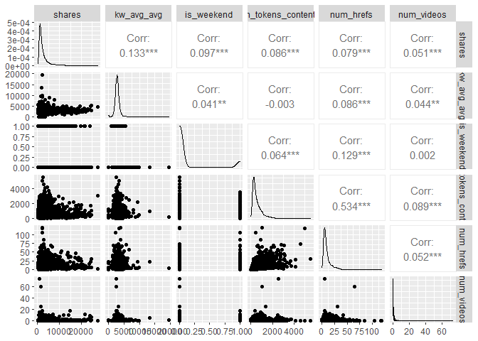
The plot below presents histograms, scatter plots, and correlations in a
bivariate structure of the top 5 variables chosen in the correlation
analysis. Notice the shape of the distributions and the values of the
correlations relative to the response variable shares.
# bivariate correlation plot
cor_data <- cbind(select(activeTrain,shares),var_sel[,var_id[1:5]])
ggpairs(cor_data)
PCA: Biplot
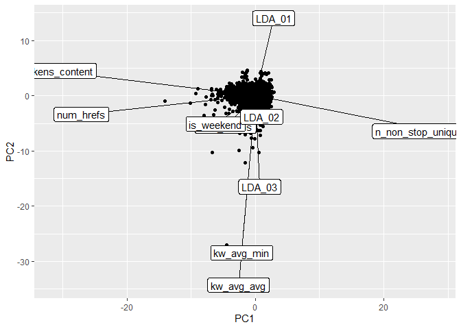
The biplot below presents the PC1 and PC2 from the PCA analysis. The
function ggplot() was used to create the plot and the segments created
via geom_segment() were re-scaled so that we could better see the
variable names. The most variation in the data is contained in the PC1,
hence, the most important variables in the data are approximately
oriented towards the axis of PC1 and, therefore, may be good predictors
for the shares response. Likewise, for PC2, which contains the second
most variability in the data set, the variables that are oriented
approximately towards the axis of PC2 are the second most important
variables.
pc_df<-data.frame(PC$x)
# plotting PC1 and PC2 for the top 5 variables
# biplot(PC, cex = 1)
ggplot(pc_directions)+
  geom_point(data = pc_df, mapping = aes(x=PC1, y=PC2))+
  geom_segment(aes(x = 0, y = 0, yend = 50 * PC2, xend = 50 * PC1))+
  geom_label(mapping = aes(x = 51 * PC1, y = 51 * PC2, label = row.names(pc_directions)))
Scatter Plots by LDA Value
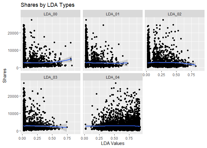
The scatter plots below show the different levels of the variables
related to the LDA metrics, from 0 to 4, and graphs the relationship
with the response variable shares. The function ggplot() is used to
create the plot frame and geom_point(), geom_smooth, and
facet_wrap() function are used to plot the scatter points, the smooth
GAM (Generalized Additive Models) lines, and split the data by LDA type,
respectively. It is possible to see the behavior of the response
variable in relation to each LDA types. A common analysis using scatter
plots is related to the pattern shown by the smooth curve fitted to the
points. If this curve shows a flat or constant line parallel to the
predictor axis, then the predictor has little contribution to the
explanation of the variance of the response variable.
LDA.dat = activeTrain %>%
  select(shares, starts_with("LDA")) %>%
  pivot_longer(cols = LDA_00:LDA_04, names_to = "LDA", values_to = "values")

# relationship between shares and LDA levels (facet_wrap+smooth)
ggplot(LDA.dat, aes(y = shares, x = values))+
  geom_point() + geom_smooth(method = "loess")+ facet_wrap(~LDA)+
labs(x = "LDA Values", y = "Shares", title = "Shares by LDA Types")
Scatter Plots by Keyword Metrics
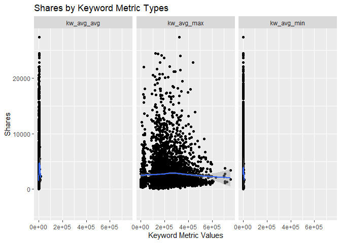
The scatter plots below show the different types of the variables
related to the Keyword metrics and graphs the relationship with the
response variable shares. The function ggplot() is used to create
the plot frame and geom_point(), geom_smooth, and facet_wrap()
function are used to plot the scatter points, the smooth GAM
(Generalized Additive Models) lines, and split the data by keyword type,
respectively. It is possible to see the behavior of the response
variable in relation to each of the 3 keyword metric types.
# relationship between shares and keyword metrics
kw.dat = activeTrain %>%
  select(shares, kw_avg_max, kw_avg_avg, kw_avg_min) %>%
  pivot_longer(cols = 2:4, names_to = "keyword", values_to = "values")

# relationship between shares and keyword metrics types (facet_wrap+smooth)
ggplot(kw.dat, aes(y = shares, x = values))+
  geom_point() + geom_smooth(method = "loess")+ facet_wrap(~keyword)+
labs(x = "Keyword Metric Values", y = "Shares", title = "Shares by Keyword Metric Types")
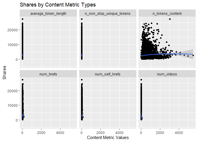
Scatter Plots by Content Metrics
The scatter plots below show the different types of the variables
related to the Content metrics and graphs the relationship with the
response variable shares. The function ggplot() is used to create
the plot frame and geom_point(), geom_smooth, and facet_wrap()
function are used to plot the scatter points, the smooth GAM
(Generalized Additive Models) lines, and split the data by content type,
respectively. It is possible to see the behavior of the response
variable in relation to each of the 4 content metric types.
# relationship between shares and content metrics (facet_wrap+smooth)
cont.dat = activeTrain %>%
  select(shares, num_videos, n_tokens_content, n_non_stop_unique_tokens,
         num_hrefs, num_self_hrefs, average_token_length) %>%
  pivot_longer(cols = 2:7, names_to = "content", values_to = "values")

# relationship between shares and content metrics types (facet_wrap+smooth)
ggplot(cont.dat, aes(y = shares, x = values))+
  geom_point() + geom_smooth(method = "loess")+ facet_wrap(~content)+
labs(x = "Content Metric Values", y = "Shares", title = "Shares by Content Metric Types")
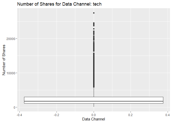
Box Plot of Shares for Data Channel tech
The following box plot shows the distribution of shares for this data
channel. The main chunk of the data can be seen within the “box”
representing the region encompassing the first and third quartiles. For
some cases, there are possible outliers in the data that make
distortions to the box plot and this mentioned “box” looks thinner than
usual. If this happens, then it means that the possible outliers are
much larger than the main chunk of data. The outliers usually appear as
individual points in the box plot. The graph below shows this pattern
for the response variable shares. However, the data might not have
outliers and the highlighted data points are in fact part of the data.
This stresses the importance of knowing about the subject and data set
in order to perform statistical analysis.
boxSharesGraph <- ggplot(statsData, aes(y = shares))
boxSharesGraph + geom_boxplot() +
  ggtitle(paste("Number of Shares for Data Channel:", dataChannelSelect)) +
  ylab("Number of Shares") +
  xlab("Data Channel")
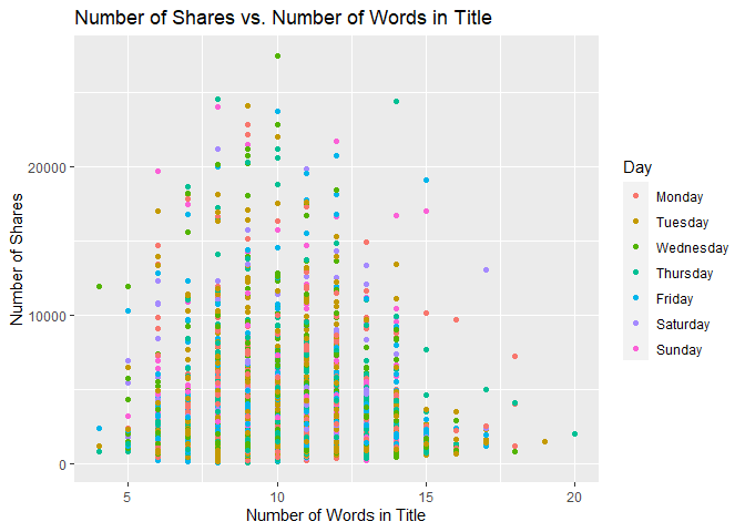
Scatter Plot of Title Words
The following graph shows the number of shares compared to the number of words in the title. The output is colored by the day of the week.
titlewordcountGraph <- ggplot(statsData, aes(x = n_tokens_title, y = shares))
titlewordcountGraph + geom_point(aes(color = Day)) +
  ggtitle("Number of Shares vs. Number of Words in Title") +
  ylab("Number of Shares") +
  xlab("Number of Words in Title")
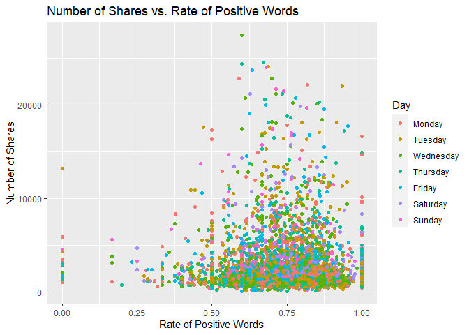
Scatter Plot of Positive Words
The following plot shows the number of shares by the rate of positive words in the article. A positive trend would indicate that articles with more positive words are shared more often than articles with negative words.
positivewordrateGraph <- ggplot(statsData, aes(x = rate_positive_words, y = shares))
positivewordrateGraph + geom_point(aes(color = Day)) +
  ggtitle("Number of Shares vs. Rate of Positive Words") +
  ylab("Number of Shares") +
  xlab("Rate of Positive Words")
Scatter Plot of Title Subjectivity
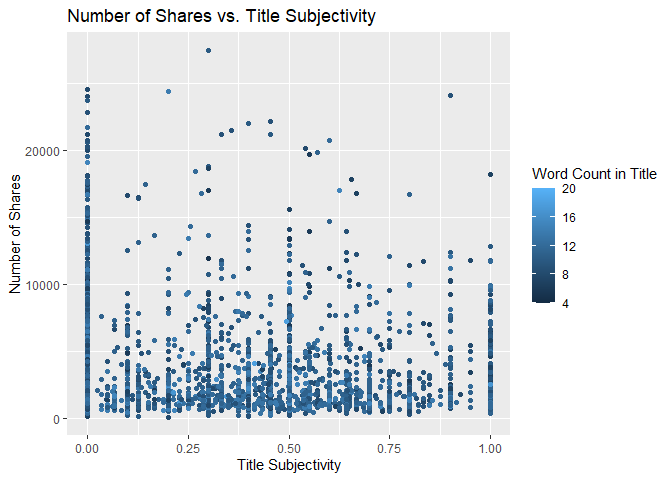
The following plot shows the total number of shares as related to the parameter title subjectivity. A positive trend would indicate that articles are shared more often when the title is subjective. A negative trend would indicate that articles are shared more often when the title is less subjective.
titleSubjectivityGraph <- ggplot(statsData, aes(x = title_subjectivity, y = shares))
titleSubjectivityGraph + geom_point(aes(color = n_tokens_title)) +
  ggtitle("Number of Shares vs. Title Subjectivity") +
  ylab("Number of Shares") +
  xlab("Title Subjectivity") +
  labs(color = "Word Count in Title")
Modeling
In this section, we will perform regression for prediction purposes for
the data channel tech. All models were fitted using 5-fold
Cross-Validation via train() function from caret package. All
variables were scaled and centered as well.
Data Manipulation for Modeling
Subsetting Variables for Modeling
The variables selected below are those described in the introduction of
this study and will be used in the modeling section. The function
select() was used to subset the corresponding variables from the
training and test sets and two new objects are created specially for the
modeling section, dfTrain and dfTest.
dfTrain = activeTrain %>%
  select(shares, starts_with("LDA_"), average_token_length,
         is_weekend, n_tokens_content, n_non_stop_unique_tokens, num_hrefs,
         num_self_hrefs, num_videos, average_token_length, kw_avg_min,
         kw_avg_max, kw_avg_avg, is_weekend)

dfTest = activeTest %>%
  select(shares, starts_with("LDA_"), average_token_length,
         is_weekend, n_tokens_content, n_non_stop_unique_tokens, num_hrefs,
         num_self_hrefs, num_videos, average_token_length, kw_avg_min,
         kw_avg_max, kw_avg_avg, is_weekend)
Linear Regression Modeling
Linear regression is a modeling technique by which one attempts to model
a response variable (in this case shares) with one or more explanatory
variables using a straight line. A model with only one explanatory
variable is called simple linear regression (SLR). In simple linear
regression, the response variable is predicted by an intercept and a
regression coefficient multiplied by the value of your explanatory
variable. The goal of regression is to determine the intercept and the
regression coefficients. This is done by fitting a straight line across
all of the data with the goal of minimizing the residuals sum of squares
via Least Squares method. The model is fit by minimizing the sum of
squared errors (SSE).
The same concept can be applied to multiple linear regression (MLR), which has more than one explanatory variable. In this case, the goal is to determine the intercept and a regression coefficient corresponding to each explanatory variable in an attempt to minimize the sum of squared errors.
In R, MLR is generally done with the function lm. There are also a
variety of other methods that fall under the umbrella of MLR. One of
these methods, LASSO regression, will be explored as part of this
analysis.
Linear Regression Model #1: Multiple Linear Regression Using lm
Here, modeling for linear regression is done with the caret package
using the method lm. The summary function gives us the regression
coefficients.
lmFit = train(shares~., data = dfTrain,
              method="lm",
              preProcess = c("center","scale"),
              trControl = trainControl(method="CV",number=5))

summary(lmFit)
##
## Call:
## lm(formula = .outcome ~ ., data = dat)
##
## Residuals:
##      Min       1Q   Median       3Q      Max
## -10313.0  -1455.9   -866.1    277.0  22650.9
##
## Coefficients: (1 not defined because of singularities)
##                          Estimate Std. Error t value Pr(>|t|)
## (Intercept)              2683.640     39.922  67.223  < 2e-16 ***
## LDA_00                     11.398     40.473   0.282 0.778251
## LDA_01                    -52.337     40.920  -1.279 0.200952
## LDA_02                     83.893     41.711   2.011 0.044347 *
## LDA_03                     -5.727     40.939  -0.140 0.888753
## LDA_04                         NA         NA      NA       NA
## average_token_length      -45.444     44.222  -1.028 0.304172
## is_weekend                235.792     40.395   5.837 5.64e-09 ***
## n_tokens_content          213.841     57.155   3.741 0.000185 ***
## n_non_stop_unique_tokens  -12.935     55.469  -0.233 0.815618
## num_hrefs                 157.485     55.892   2.818 0.004856 **
## num_self_hrefs           -218.470     50.820  -4.299 1.75e-05 ***
## num_videos                117.295     40.544   2.893 0.003832 **
## kw_avg_min               -147.259     45.996  -3.202 0.001375 **
## kw_avg_max               -208.635     47.709  -4.373 1.25e-05 ***
## kw_avg_avg                467.697     48.382   9.667  < 2e-16 ***
## ---
## Signif. codes:  0 '***' 0.001 '**' 0.01 '*' 0.05 '.' 0.1 ' ' 1
##
## Residual standard error: 2852 on 5090 degrees of freedom
## Multiple R-squared:  0.04353,    Adjusted R-squared:  0.0409
## F-statistic: 16.55 on 14 and 5090 DF,  p-value: < 2.2e-16
The following table shows the output training metrics for this linear regression.
lm_out = data.frame(lmFit$results)

kable(lm_out, caption = "Output Training Metrics for Linear Regression",
      digits = 3)
| intercept | RMSE | Rsquared | MAE | RMSESD | RsquaredSD | MAESD |
|---|---|---|---|---|---|---|
| TRUE | 2855.232 | 0.037 | 1757.933 | 231.097 | 0.012 | 78.415 |
Output Training Metrics for Linear Regression
The following shows the RMSE, RSquared, and MAE values for the model as it performed on predicting the test set.
metric_lm = postResample(pred = predict(lmFit, newdata = dfTest),
                         obs = dfTest$shares)

metric_lm
##         RMSE     Rsquared          MAE
## 5.015551e+03 3.619879e-02 2.088571e+03
Linear Regression Model #2: LASSO Regression using glmnet
The linear regression chosen for this next model is based on penalized
regression via LASSO regression. This method has a particular advantage
of having a triangular shape of parameters search space so that it
allows the estimated coefficients to be zero. This is due to LASSO
optimization that has in the loss function the penalty associating the
sum of the absolute value of the parameters multiplied by lambda, the
penalty term (hyperparameter). Hence, LASSO regression is also a
variable selection method. In this application, we will test the
prediction capability of LASSO regression only. It was tested a sequence
of values for the Regularization Parameter (lambda), a tuning
parameter, from 0 to 10 by 1 via seq(0,10,1) assigned to the
tuneGrid =argument in the train() function from caret package. The
code below presents the estimated coefficients for the best
hyperparameter.
LASSO = train(shares~., data = dfTrain,
              method="glmnet",
              preProcess = c("center","scale"),
              tuneGrid = expand.grid(alpha = 1, lambda = seq(0,10,1)),
              trControl = trainControl(method="CV",number=5))

coef(LASSO$finalModel, LASSO$bestTune$lambda)
## 16 x 1 sparse Matrix of class "dgCMatrix"
##                                     s1
## (Intercept)              2683.63996082
## LDA_00                      0.08651943
## LDA_01                    -44.86412235
## LDA_02                     72.40442398
## LDA_03                      .
## LDA_04                      .
## average_token_length      -32.20031813
## is_weekend                228.85717837
## n_tokens_content          208.46249237
## n_non_stop_unique_tokens   -7.78713527
## num_hrefs                 141.93239311
## num_self_hrefs           -194.97804184
## num_videos                106.83337253
## kw_avg_min               -121.92522564
## kw_avg_max               -181.86777383
## kw_avg_avg                443.37677517
The best lambda for this model is 10 and this value can be seen in the
table below which summarizes all the metrics for the 5-fold
cross-validation.
lasso_out = data.frame(LASSO$results)

kable(lasso_out, caption = "Output Training Metrics for LASSO",
      digits = 3)
| alpha | lambda | RMSE | Rsquared | MAE | RMSESD | RsquaredSD | MAESD |
|---|---|---|---|---|---|---|---|
| 1 | 0 | 2863.232 | 0.037 | 1759.106 | 208.928 | 0.018 | 62.389 |
| 1 | 1 | 2863.227 | 0.037 | 1759.094 | 208.928 | 0.018 | 62.378 |
| 1 | 2 | 2863.101 | 0.037 | 1759.013 | 208.829 | 0.018 | 62.254 |
| 1 | 3 | 2862.983 | 0.037 | 1758.947 | 208.727 | 0.018 | 62.137 |
| 1 | 4 | 2862.876 | 0.037 | 1758.884 | 208.629 | 0.018 | 62.018 |
| 1 | 5 | 2862.780 | 0.037 | 1758.836 | 208.521 | 0.018 | 61.882 |
| 1 | 6 | 2862.692 | 0.037 | 1758.788 | 208.410 | 0.018 | 61.742 |
| 1 | 7 | 2862.609 | 0.037 | 1758.744 | 208.302 | 0.018 | 61.598 |
| 1 | 8 | 2862.534 | 0.037 | 1758.711 | 208.195 | 0.018 | 61.461 |
| 1 | 9 | 2862.466 | 0.037 | 1758.684 | 208.090 | 0.018 | 61.325 |
| 1 | 10 | 2862.406 | 0.037 | 1758.663 | 207.987 | 0.018 | 61.183 |
Output Training Metrics for LASSO
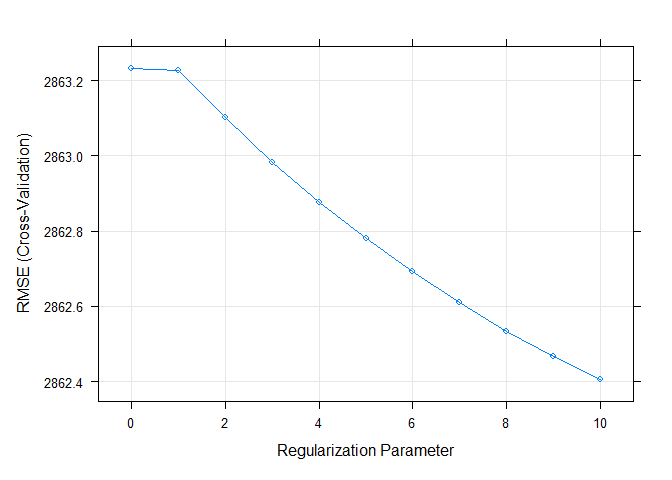
The plot below shows the RMSE by Regularization Parameter (lambda). It
is easy to see that RMSE is minimized when lambda = 10.
plot(LASSO)
The validation step for LASSO regression is applied on the test set
after predicting the response variable for unseen data (test set). By
using predict() and postResample() functions, the metrics RMSE (Root
Means Squared Error), Rsquared (Coefficient of Determination), and MAE
(Mean Absolute Error) are calculated and displayed below.
metric_LASSO = postResample(pred = predict(LASSO, newdata = dfTest),
                            obs = dfTest$shares)

metric_LASSO
##         RMSE     Rsquared          MAE
## 5.018754e+03 3.568045e-02 2.089045e+03
Tree-Based Modeling
The next two models, Random Forest and Boosted Tree, are both types of tree-based modeling methods. Generally speaking, in a tree-based modeling method, the predictor space is split into regions, with different predictions for each region. In the case of regression trees where the goal is to predict a continuous response, the mean of observations for a given region is typically used to make the predictions.
To make the predictions, the trees are split using recursive binary splitting. For every possible value of each predictor, find the residual sum of squares (RSS) and try to minimize that. The process is repeated with each split. Often, trees are grown very large and need to be cut back using cost complexity pruning. This ensures that the model is not overfit and will work well on prediction of new data.
Random Forest Model
In this section, we attempt to model the data using a Random Forest model, which is a type of ensemble learning which averages multiple tree models in order to lower the variance of the final model and thus improve our prediction.
In a random forest model, we first begin by creating multiple trees from
bootstrap samples. A random subset of predictors is used to create each
bootstrap sample. The predictors are selected randomly to prevent the
trees from being correlated. If the random subset was not used (as in
another tree based method called bagging), the trees would likely all
choose the same predictors for the first split. Choosing the splits
randomly avoids this correlation. The number of predictors is specified
by mtry. The maximum number of predictors for a regression model is
generally chosen to be the total number of predictors divided by 3. Once
the bootstrap sample statistics are collected, they are averaged and
used to select a final model.
Random forest models use “out of bag” error to test the data using samples from the original data set that were not included in a particular bootstrap data set.
For the random forest model, we will use the train function from the
caret package. We set the mtry to select 1-5 predictors.
train.control = trainControl(method = "cv", number = 5)

rfFit <- train(shares~.,
               data = dfTrain,
               method = "rf",
               trControl = train.control,
               preProcess = c("center","scale"),
               tuneGrid = data.frame(mtry = 1:5))

rfFit$bestTune$mtry
## [1] 1
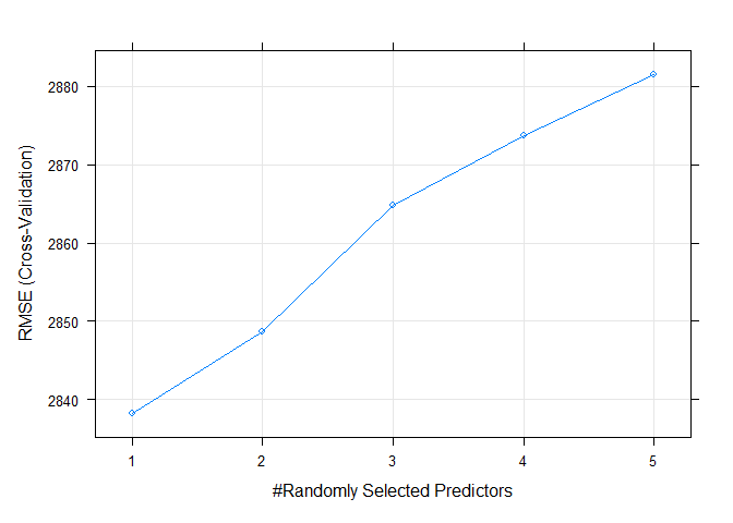
The best mtry for this particular model was 1.
The following plot shows the RMSE values for each of the tune. The objective in random forest modeling is to choose the model with the lowest RMSE.
plot(rfFit)
The following table shows training metrics for the random forest model. Again, the best model is the one that minimizes RMSE.
rf_out = data.frame(rfFit$results)

kable(rf_out, caption = "Output Training Metrics for Random Forest",
      digits = 3)
| mtry | RMSE | Rsquared | MAE | RMSESD | RsquaredSD | MAESD |
|---|---|---|---|---|---|---|
| 1 | 2838.201 | 0.051 | 1766.749 | 106.310 | 0.010 | 54.588 |
| 2 | 2848.644 | 0.048 | 1796.780 | 106.996 | 0.011 | 54.525 |
| 3 | 2864.866 | 0.043 | 1814.860 | 106.131 | 0.008 | 53.289 |
| 4 | 2873.700 | 0.042 | 1824.117 | 104.295 | 0.011 | 55.495 |
| 5 | 2881.532 | 0.040 | 1831.895 | 107.066 | 0.012 | 56.363 |
Output Training Metrics for Random Forest
Now we will run a prediction on our test data split that we obtained when we split the data based on a 70/30 split. The table shows the RMSE value for the test data set, which is an indication of how well our model worked to predict data that was not included when training the original model. We can compare this model against other models to find the model with the lowest RMSE.
RF_pred <- predict(rfFit, newdata = activeTest)

metric_rf = postResample(RF_pred, activeTest$shares)

metric_rf
##         RMSE     Rsquared          MAE
## 4.997206e+03 4.706505e-02 2.092497e+03
Boosted Tree Model
In this section the Ensemble Learning algorithm Boosting will be
trained. Boosted tree method is one of the Tree based models most used
in data science because it presents a fitting strategy that improves
sequentially throughout the iterations. Boosting uses single trees
fitted (each single tree has d splits) on the training data and
produces predictions off of that training. The residuals of this
prediction is, then, used as response variable for the next single tree
training step. New predictions are done for this new model as well and
so on. This process occurs several times during B iterations and the
predictions are updated during the fitting process, being driven by the
shrinkage parameter, also called growth rate, lambda. These training
features of Boosting make this method to produce a reduction in the
variance of the predictions as well as gains in precision, mainly over
Random Forest, Bagging, and single tree. The shrinkage parameter will be
set as 0.1 and n.minobsinnode set as 10. The parameters n.tree and
interaction.depth will be chosen based on 5-fold cross-validation. The
former will be chosen from a sequence from 25 to 200, counting by 25.
The latter will be chosen from a sequence from 1 to 4. The code below
shows the training and tuning procedure and prints out the resultant
values of the two considered hyperparameters.
tunG = expand.grid(n.trees = seq(25,200,25),
                   interaction.depth = 1:4,
                   shrinkage = 0.1,
                   n.minobsinnode = 10)

gbmFit <- train(shares~.,
               data = dfTrain,
               method = "gbm",
               preProcess = c("center","scale"),
               trControl = train.control,
               tuneGrid = tunG,
               verbose = FALSE
               )

gbmFit$bestTune$n.trees
## [1] 75
gbmFit$bestTune$interaction.depth
## [1] 2
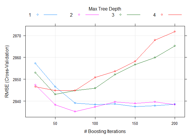
The best n.trees and interaction.depth parameters for this model are 75 and 2, respectively. These values can be seen in the table below, which summarizes all the metrics for the 5-fold cross-validation. It is easy to see that these values minimize the RMSE.
gbm_out = data.frame(gbmFit$results)

gbm_out <- gbm_out %>%
  arrange(RMSE)

kable(gbm_out, caption = "Output Training Metrics for Boosting",
      digits = 3, row.names = FALSE)
| shrinkage | interaction.depth | n.minobsinnode | n.trees | RMSE | Rsquared | MAE | RMSESD | RsquaredSD | MAESD |
|---|---|---|---|---|---|---|---|---|---|
| 0.1 | 2 | 10 | 75 | 2835.256 | 0.050 | 1748.003 | 212.517 | 0.011 | 63.273 |
| 0.1 | 2 | 10 | 100 | 2837.411 | 0.049 | 1744.089 | 214.689 | 0.010 | 64.799 |
| 0.1 | 1 | 10 | 150 | 2837.458 | 0.049 | 1748.162 | 207.207 | 0.014 | 56.296 |
| 0.1 | 1 | 10 | 175 | 2837.826 | 0.049 | 1743.917 | 208.351 | 0.012 | 54.858 |
| 0.1 | 2 | 10 | 50 | 2838.289 | 0.048 | 1750.229 | 207.249 | 0.009 | 60.028 |
| 0.1 | 2 | 10 | 200 | 2838.396 | 0.051 | 1740.185 | 210.381 | 0.012 | 70.185 |
| 0.1 | 1 | 10 | 100 | 2838.451 | 0.048 | 1746.244 | 207.615 | 0.012 | 56.175 |
| 0.1 | 1 | 10 | 200 | 2838.494 | 0.048 | 1743.943 | 208.451 | 0.013 | 58.987 |
| 0.1 | 1 | 10 | 125 | 2838.665 | 0.048 | 1748.324 | 207.450 | 0.014 | 58.560 |
| 0.1 | 2 | 10 | 150 | 2838.913 | 0.050 | 1741.923 | 211.143 | 0.009 | 62.996 |
| 0.1 | 1 | 10 | 75 | 2839.029 | 0.048 | 1749.316 | 208.495 | 0.012 | 59.289 |
| 0.1 | 2 | 10 | 175 | 2839.657 | 0.050 | 1744.306 | 211.794 | 0.011 | 64.090 |
| 0.1 | 2 | 10 | 125 | 2839.683 | 0.048 | 1743.534 | 214.334 | 0.009 | 69.230 |
| 0.1 | 3 | 10 | 50 | 2843.075 | 0.045 | 1748.025 | 222.347 | 0.013 | 67.385 |
| 0.1 | 3 | 10 | 75 | 2844.844 | 0.045 | 1745.765 | 221.200 | 0.011 | 71.607 |
| 0.1 | 4 | 10 | 50 | 2844.858 | 0.046 | 1753.693 | 211.087 | 0.013 | 68.563 |
| 0.1 | 4 | 10 | 75 | 2844.869 | 0.048 | 1748.371 | 214.883 | 0.013 | 68.984 |
| 0.1 | 3 | 10 | 100 | 2845.895 | 0.046 | 1747.806 | 223.915 | 0.011 | 71.380 |
| 0.1 | 4 | 10 | 25 | 2846.528 | 0.042 | 1764.193 | 208.244 | 0.009 | 66.041 |
| 0.1 | 1 | 10 | 50 | 2846.626 | 0.043 | 1758.496 | 210.036 | 0.012 | 60.242 |
| 0.1 | 2 | 10 | 25 | 2847.331 | 0.044 | 1761.935 | 210.075 | 0.009 | 62.168 |
| 0.1 | 4 | 10 | 100 | 2850.818 | 0.047 | 1752.562 | 221.171 | 0.012 | 71.224 |
| 0.1 | 3 | 10 | 125 | 2852.235 | 0.044 | 1747.469 | 225.724 | 0.012 | 71.809 |
| 0.1 | 3 | 10 | 25 | 2852.937 | 0.038 | 1760.384 | 216.781 | 0.010 | 63.694 |
| 0.1 | 4 | 10 | 125 | 2853.708 | 0.047 | 1754.022 | 219.120 | 0.011 | 71.015 |
| 0.1 | 3 | 10 | 150 | 2856.747 | 0.043 | 1752.054 | 225.617 | 0.010 | 71.103 |
| 0.1 | 1 | 10 | 25 | 2857.255 | 0.040 | 1768.748 | 210.789 | 0.011 | 60.095 |
| 0.1 | 4 | 10 | 150 | 2858.221 | 0.047 | 1759.407 | 217.599 | 0.010 | 69.077 |
| 0.1 | 3 | 10 | 175 | 2859.928 | 0.043 | 1755.121 | 225.644 | 0.010 | 72.722 |
| 0.1 | 3 | 10 | 200 | 2865.295 | 0.042 | 1760.725 | 222.608 | 0.010 | 67.496 |
| 0.1 | 4 | 10 | 175 | 2867.915 | 0.044 | 1766.602 | 222.489 | 0.011 | 76.572 |
| 0.1 | 4 | 10 | 200 | 2871.784 | 0.044 | 1772.723 | 217.188 | 0.009 | 71.988 |
Output Training Metrics for Boosting
The plot below shows the RMSE by Number of Boosting Iterations and display Max Tree Depth lines for the 5-fold CV performed. It is easy to see that RMSE is minimized when n.trees = 75 and interaction.depth = 2.
plot(gbmFit)
The validation step for Boosting is applied on the test set after
predicting the response variable for unseen data (test set). By using
predict() and postResample() functions, the metrics RMSE (Root Means
Squared Error), Rsquared (Coefficient of Determination), and MAE (Mean
Absolute Error) are calculated and displayed below.
gbm_pred <- predict(gbmFit, newdata = activeTest)

metric_boosting = postResample(gbm_pred, activeTest$shares)

metric_boosting
##         RMSE     Rsquared          MAE
## 4.987962e+03 4.891964e-02 2.072540e+03
Model Comparison & Conclusion
For the overall comparison among all 4 created models in previous sections, the test set was used for predictions and some quality of fit metrics were calculated based on these prediction on unseen data. The code below shows the function that returns the name of the best model based on RMSE values estimated on the test set. The code below displays the table comparing all 4 models.
bestMethod = function(x){

  bestm = which.min(lapply(1:length(x), function(i) x[[i]][1]))

  out = switch(bestm,
                "Random Forest",
                "Boosting",
                "LASSO Regression",
                "Multiple Linear Regression")

  return(out)

}

tb = data.frame(RF = metric_rf, Boosting = metric_boosting,
                LASSO = metric_LASSO, Linear = metric_lm)

kable(tb, caption = "Accuracy Metric by Ensemble Method on Test Set",
      digits = 3)
| RF | Boosting | LASSO | Linear | |
|---|---|---|---|---|
| RMSE | 4997.206 | 4987.962 | 5018.754 | 5015.551 |
| Rsquared | 0.047 | 0.049 | 0.036 | 0.036 |
| MAE | 2092.497 | 2072.540 | 2089.045 | 2088.571 |
Accuracy Metric by Ensemble Method on Test Set
After comparing all the 4 models fit throughout this analysis, the best model was chosen based on the RMSE value, such that the model with minimum RMSE is the “winner”. Therefore, the best model is Boosting based on RMSE metric. The RMSE, coefficient of determination, and MAE metrics for all 4 models can be seen in the table above.
Reference List
K. Fernandes, P. Vinagre and P. Cortez. A Proactive Intelligent Decision Support System for Predicting the Popularity of Online News. Proceedings of the 17th EPIA 2015 - Portuguese Conference on Artificial Intelligence, September, Coimbra, Portugal.